Creating Visual Interest: How to Use MouseMove Hover to Reveal Background Images


Canva celebrated 15 billion designs on its platform on February 15, 2023, marking a huge milestone for the company. To celebrate the event, the company created a special background image featuring designs made on the platform. When you move your mouse around the page, the image gets revealed, creating a cool effect. I found it interesting and decided to recreate it using HTML, CSS, and JavaScript. This article will show you how to recreate the effect step by step.

Prerequisites
This article assumes you have a basic knowledge of HTML, CSS and JavaScript. You'll also need a code editor and a web browser. I'll be using VS Code and Chrome, but you can use whatever you like.
To follow along, clone or download the starter files here
Getting Started
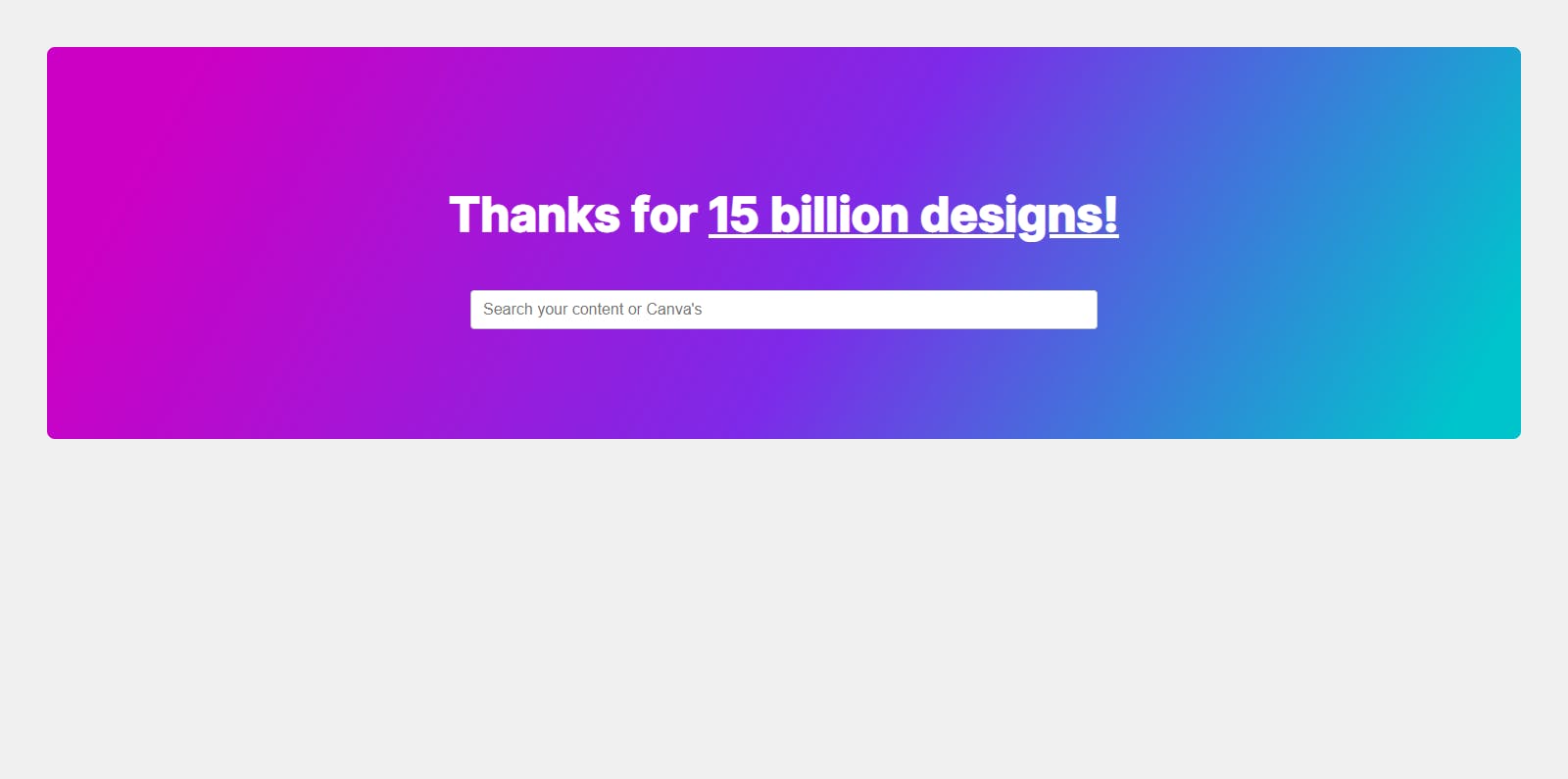
First, create the HTML markup for the container and background image. The container is where the background image will be revealed on hover.
<div class="container">
  <h1>Thanks for <u>15 billion designs!</u></h1>
  <input type="text" placeholder="Search your content or Canva's" />
  <div class="hover"></div>
</div>
The container is where all the content will be. The hover div is empty for now, but we will add the background image using CSS.
Styling the Container
Next, copy the following CSS into the styles.css file. This will style the container and the other elements in the app.
.container {
  position: relative;
  display: flex;
  justify-content: center;
  align-items: center;
  flex-direction: column;
  margin: auto;
  width: 100%;
  height: 25rem;
  background: linear-gradient(
    119.42deg,
    #cc00c4 8.94%,
    #7d2ae8 54.02%,
    #00c4cc 95.49%
  );
  border-radius: 8px;
  text-align: center;
  padding: 0.5rem;
  overflow: hidden;
}

h1 {
  color: #fff;
  font-size: 3rem;
  position: relative;
  z-index: 10;
  margin-top: 1rem;
}

input {
  position: relative;
  margin-top: 2rem;
  padding: 9px 4px 9px 40px;
  border: 1px solid #2b3b4a4d;
  outline: none;
  color: #0d1216;
  padding: 0 12px;
  font-size: 1rem;
  border-radius: 4px;
  height: 2.5rem;
  width: 40rem;
  max-width: 100%;
  z-index: 10;
}
In the CSS above, we set the container to position: relative so that we can position the background image inside it. We also set the overflow property to hidden so that the background image doesn't overflow the container.
We also set the z-index property of the h1 and input elements to 10 so that they appear above or on top of the background image.
Here is what we have so far:
Adding the Background Image
Next, we'll target the .hover class and add the background image. We'll also set the position property to absolute so that we can position the image inside the container.
Copy the following CSS into the styles.css file:
.hover {
  opacity: 0;
  position: absolute;
  transition: all 0.5s ease;
  width: 10rem;
  height: 10rem;
  background: url(img/giphy.gif) 50% 50% fixed;
  border-radius: 50%;
  box-shadow: 0 0 30px 30px rgba(255, 255, 255, 0.15);
  filter: blur(1px);
  z-index: 5;
}
The opacity property is set to 0 so that the image is hidden by default. We'll use JavaScript to change the opacity to 1 when the user hovers over the container.
Additionally, for the background property, we used the shorthand syntax to set the background image, position, size and repeat. We also set the fixed value for the background-attachment property so that the image stays in place when the mouse moves around.
If you prefer, you can use the longhand syntax to set the background image, position, size and repeat:
background-image: url(img/giphy.gif);
background-position: 50% 50%;
background-attachment: fixed;
Revealing the Background Image
To reveal the background image, we'll use JavaScript to track the movement of the user's mouse cursor and change the opacity of the background image.
Create a new file called app.js and add the following code:
const hover = document.querySelector(".hover");
const hoverWHalf = hover.offsetWidth / 1.5;
const container = document.querySelector(".container");

container.addEventListener("mousemove", (e) => {
  hover.style.left = e.pageX - hoverWHalf + "px";
  hover.style.top = e.pageY - hoverWHalf + "px";
  hover.style.opacity = "1";
});
In the code above, we first select the .hover and .container elements using the querySelector method.
Then, we add an event listener to the container element. The event listener listens for the mousemove event, so that whenever the user moves their mouse over the container, the code will calculate the position of the .hover element and update its position and opacity dynamically.
Specifically, it calculates the horizontal and vertical midpoint of the .hover element using the offsetWidth property and then subtracts half of this value from the pageX and pageY properties of the mousemove event to determine the position of the .hover element relative to the mouse cursor.
Don't forget to link the app.js file inside the index.html file ;)
<script src="app.js"></script>
With this, we have successfully created the mousemove hover effect. Here is the final result:
Check out the live demo and source code on Github.

Conclusion
And there you have it! You've made it to the end of this article on creating visual interest using the MouseMove hover effect with HTML, CSS, and JavaScript. By now, you should have a good understanding of how to use this technique to add some excitement and creativity to your website.
Remember, there are countless ways to customize this effect and make it your own. Don't be afraid to experiment with different images, colours, and animations to create a look that perfectly matches your brand or personal style.
As you continue to develop your web design skills, be sure to keep an eye out for new and exciting trends in the industry. Who knows, you might just discover the next big thing :)
Thank you for reading! I hope you found this article helpful. If you did, kindly like and share it with your friends and colleagues :)
I would love to connect with you on Twitter | LinkedIn | Github | Portfolio.