

React is a popular JavaScript library for building user interfaces. One of the powerful features of React is the use of portals, which allow developers to render content outside of the normal React tree structure. In this article, you'll learn all about what portals are, how to use them, and some common use cases for portals in React applications.
What are Portals?
React portals provide a way to render content outside of the normal DOM hierarchy of a component. This means that you can render a child component at a different place in the DOM tree than its parent component.
In technical terms, portals in React work by creating a new DOM node and rendering a component into it. This new node is appended to the body element of the HTML document, which is outside of the normal React component tree. The rendered content can then be positioned and styled independently of the parent component.
Advantages of Using Portals
There are several advantages to using portals in React:
Flexibility: Portals allow you to render a component outside of its parent container, which can be useful in situations where you need to display content in a different part of the page.
Improved performance: By rendering a component outside of its parent container, you can reduce the amount of DOM manipulation needed to update the component, which can improve performance.
Common Use Cases for Portals
Portals can be used for a variety of UI elements. Here are some common use cases of portals in React:
Modals
Dialog boxes
Tooltips
Hover cards
Popovers
Dropdown Menus
Loaders
How to Create a Portal in React
To create a portal in React, we make use of the createPortal() API. This method takes two arguments:
children: Any valid React element that can be rendered.domNode: DOM container where thechildrenshould be rendered
Here is the syntax:
createPortal(children, domNode);
Example:
import { createPortal } from "react-dom";

const Modal = () => {
  return (
    <div className="modal">
      <h1>Modal Content</h1>
    </div>
  );
};

const Portal = () => {
  return createPortal(<Modal />, document.getElementById("modal-root"));
};
In the example above, we define a Modal component that we want to render using a portal. We then define a Portal component that uses the createPortal() method to render the Modal component in a container with the ID of modal-root.
How to Use Portals
To see how portals work, let's create a simple React app that uses portals to render a modal component. If you're working on an existing project, you can skip the first step. The complete code for this example is available on GitHub.
Step 1: Initialise your React app
First, create a new React app using Vite:
npm create vite@latest my-react-app --template react
Navigate to the project directory and install the dependencies:
cd my-react-app
npm install
npm run dev
Step 2: Create a portal container
Next, create a container element in the index.html file that will host the portal. This element should be located outside the root node of the React app, which is typically a div with an ID of root.
For this example, we'll create a div with an ID of portal and add it to the body of the HTML file:
<body>
  <div id="root"></div>
  <div id="portal"></div>
</body>
Step 3: Create the Overlay component
We will use the Overlay component as a backdrop effect when the modal opens, and also create the portal inside it.
Create a new file Overlay.jsx, in the src directory and paste the following code:
import React from "react";
import { createPortal } from "react-dom";
import "./App.css";

const Overlay = ({ closeModal, children }) => {
  return createPortal(
    <div className="overlay" onClick={closeModal}>
      {children}
    </div>,
    document.getElementById("portal")
  );
};

export default Overlay;
The Overlay component returns a JSX fragment that uses the createPortal() method from the react-dom package to render a div with children elements inside a portal.
We then set the onClick event for the div to call the closeModal function that is passed as a prop.
Step 4: Create the Modal component
Next, create a new file Modal.jsx in the src directory, and add the following code.
import React from "react";
import Overlay from "./Overlay";
import "./App.css";

const Modal = ({ closeModal }) => {
  return (
    <Overlay closeModal={closeModal}>
      <div className="modal" onClick={(e) => e.stopPropagation()}>
        <h3>Modal</h3>
        <p>
          Lorem ipsum dolor sit amet consectetur adipisicing elit. Odit, libero.
          Exercitationem quod quam perspiciatis quasi voluptate sint facilis
          quia praesentium pariatur veniam quidem nam, ullam porro eveniet
          molestiae minima eligendi.
        </p>
        <button onClick={closeModal}>Close</button>
      </div>
    </Overlay>
  );
};

export default Modal;
In the code above, the onClick event for the div is set to stop event propagation so that clicking inside the modal doesn't close it.
Additionally, the onClick event for the button element will call the closeModal function that was passed as a prop.
Step 5: Edit the App component
Copy and paste the following code into the App.jsx file.
import { useState } from "react";
import Modal from "./Modal";
import "./App.css";

function App() {
  // State to manage whether the modal is open or closed
  const [modalOpen, setModalOpen] = useState(false);

  // Function to toggle the state between open and closed
  const handleModal = () => {
    setModalOpen(!modalOpen);
  };

  return (
    <div className="App">
      <h1>React Modal Demo</h1>
      <p>
        This is a demo of how to use portals to create a modal component in
        React.
      </p>
      <button onClick={handleModal}>Open Modal</button>

      {modalOpen && <Modal closeModal={() => setModalOpen(false)} />}
    </div>
  );
}

export default App;
Here we define a state to manage whether the modal is open or closed, and a function to toggle the state. When the "Open Modal" button is clicked, the handleModal function is called and the modalOpen state is updated accordingly.
If the state is true, the Modal component is rendered, which includes a "Close" button that sets the modalOpen state to false.
Step 6: Style the App
Finally, let's style the app. Add the following code inside the App.css file:
.App {
  width: 100vw;
  height: 100vh;
  display: flex;
  flex-direction: column;
  justify-content: center;
  align-items: center;
  background-color: #f5f5f5;
}

.overlay {
  position: absolute;
  top: 0;
  left: 0;
  width: 100%;
  height: 100%;
  background: rgba(0, 0, 0, 0.5);
  backdrop-filter: blur(3px);
  display: flex;
  justify-content: center;
  align-items: center;
}

.modal {
  display: flex;
  flex-direction: column;
  justify-content: center;
  position: absolute;
  width: 450px;
  min-height: 250px;
  padding: 2rem;
  top: 20%;
  background-color: white;
  border-radius: 15px;
}

button {
  padding: 0.7rem 1.4rem;
  color: white;
  border-radius: 5px;
  text-align: center;
  cursor: pointer;
  font-weight: 600;
}
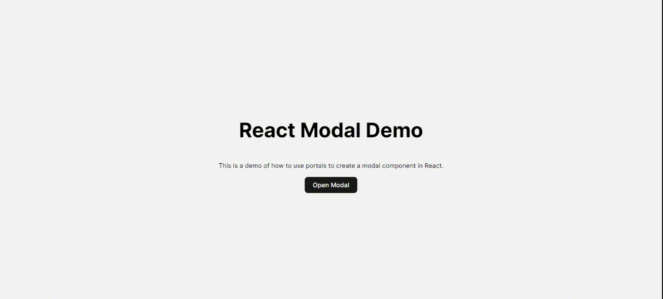
Here's what the final app looks like:
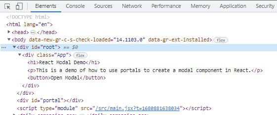
Now, let's take a closer look at how this works. Open the Developer Tools in your browser and inspect the page. You'll notice that while the modal is closed, the portal div is empty.
When you click the button to open the modal, the modal is rendered inside the portal div, just as we specified.
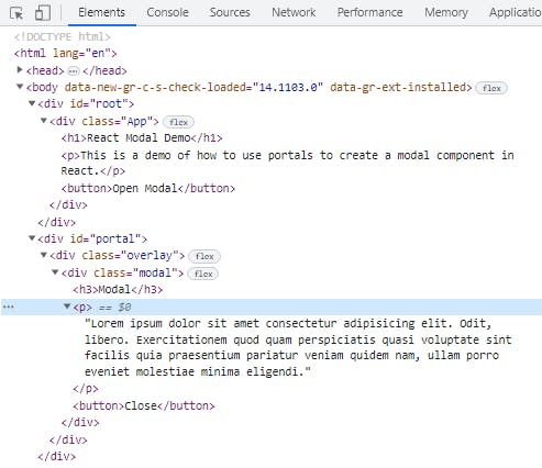
The new DOM nodes are now mounted inside the portal node instead of the App node specified in the source code. This demonstrates the functionality of portals in action.
Event Bubbling and Portals
Event bubbling refers to the way events propagate from child components to parent components in the component tree. In the case of React portals, this means that even if we render a portal outside of the parent DOM element, it still behaves like a standard React component, with access to props and state, as it remains within the DOM tree hierarchy.
Since portals only affect the HTML DOM structure and not the React component tree, features such as Context API and Event Bubbling continue to work as they did before.
To prevent event bubbling, as demonstrated in the example, you can use the stopPropagation() method to ensure that only the event listener on the portal's container is triggered.
Wrapping Up
Portals in React are a powerful feature that allows developers to render content outside of the normal component hierarchy. This can be useful for creating modals, popovers, and other UI elements that need to be positioned relative to a specific element or displayed on top of the main application interface.
When using portals, it's important to keep in mind some best practices.
First, always make sure to clean up the portal node when the component unmounts. This can be done using the
useEffecthook and theremoveChildmethod.Second, be careful not to use portals excessively, as they can add unnecessary complexity to your code.
Finally, always test your portals thoroughly for accessibility issues, as they can sometimes cause unexpected behaviour in certain browsers or screen readers. Ensure to follow the WAI-ARIA Modal Authoring Practices when working with modals.
Thank you for reading! I hope you found this article helpful. If you did, kindly like and share it with your friends and colleagues :)
I would love to connect with you on Twitter | LinkedIn | Github | Portfolio.
Happy coding!